Brand guide
The Walls, in one place.
How The Walls looks, sounds and moves. Use this page for anything we make: the site, emails, social posts, print, packaging and anything partners make about us. When in doubt, choose less: the art is the star.
01
Logo
A frame hung on a nail, and the name in Fraunces italic. The nail is our Signal color, the one bit of color the logo carries. Every file below is vector (SVG, with the words outlined, so no font is needed) or a large PNG. Transparent files have no background; solid files sit on our gallery night or paper.


Inline
The primary logo, as in the site header.
- On darkPaper ink with the Signal nail, for dark backgrounds.Transparent svg pngSolid svg png
- On lightInk with the Signal nail, for light backgrounds.Transparent svg pngSolid svg png
- WhiteOne color, for photos and dark prints.Transparent svg png
- BlackOne color, for light prints and engraving.Transparent svg png



Stacked
Square spaces: avatars, end cards, packaging.
- On darkPaper ink with the Signal nail, for dark backgrounds.Transparent svg pngSolid svg png
- On lightInk with the Signal nail, for light backgrounds.Transparent svg pngSolid svg png
- WhiteOne color, for photos and dark prints.Transparent svg png
- BlackOne color, for light prints and engraving.Transparent svg png





Mark
Favicons, app icons, watermarks, tight spaces.
- On darkPaper ink with the Signal nail, for dark backgrounds.Transparent svg pngSolid svg png
- On lightInk with the Signal nail, for light backgrounds.Transparent svg pngSolid svg png
- WhiteOne color, for photos and dark prints.Transparent svg png
- BlackOne color, for light prints and engraving.Transparent svg png








Spacing
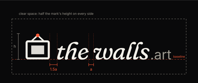
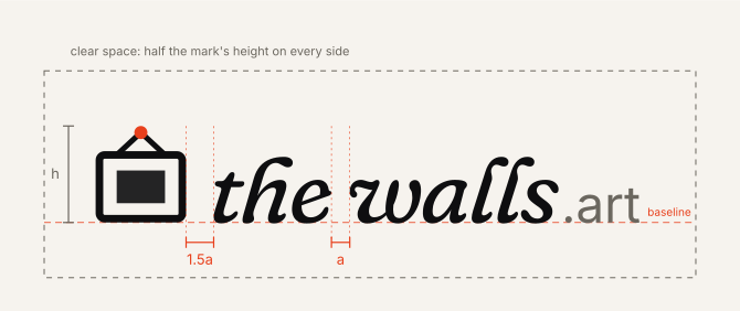
Use the files as they are. If you ever rebuild the inline logo, these are the measurements.
- The gap
- The frame stands 1.5a from "the", where a is the space between "the" and "walls". Measure from the outside of the frame to the ink of the t, not to the letter's box.
- One line
- The words sit on the bottom edge of the frame. The frame, "the walls" and ".art" share that baseline.
- Sizes
- "the walls" is Fraunces italic at 83% of the mark's height with -2.5% tracking. ".art" is Inter at 46%, in Graphite, just after the s.
- Clear space
- Half the mark's height on every side, h/2 in the guide. Every file above already includes it.
02
Using the logo
Give it room, keep it whole, and let it sit quietly next to the art.
Clear space
Keep empty space around the logo at least half the height of the mark on every side. The files already include it.
Smallest size
Inline: 120 px or 25 mm wide. Stacked: 64 px or 14 mm wide. Below that, use the mark alone (16 px is the smallest).
On the art
Never set the logo straight on an artwork. Put it on a solid color or on the wall around the work.
Keep the spacing
Never move the words closer to the frame or further away. If you rebuild the logo, follow the spacing guide above.
Colors
Use the two-color logos wherever color is possible. One-color white or black only when printing in one ink, or on a photo.
Do not
Stretch, rotate, outline, add shadows or glows, change the font, recolor the frame, or move the nail. Do not write it as The Walls Art.
In words, we are The Walls (capital T and W). The address is thewalls.art, always lower case.
03
Color
A dark gallery after hours is our default, with a warm paper version for light. One Signal accent, used sparingly: the nail, the main button, one highlight at a time. Everything else stays neutral so the art carries the color.
Dark (default)
Gallery night
#09090a
Page background. Dark is the default theme.
Paper
#f4f1ea
Text and the logo on dark.
Signal
#ff5a36
The nail on the logo, calls to action, one highlight per view.
Plinth
#151517
Cards and panels.
Graphite
#9d998f
Secondary text, the .art of the wordmark.
Mat
#ece8df
Passe-partout around artwork; light paper in print.
Ember
#ff8f6b
Hover and secondary accents.
Linen
#d9d5cc
Body text on dark.
Light
Gallery night
#f6f3ee
Page background. Dark is the default theme.
Paper
#0e0e10
Text and the logo on dark.
Signal
#e8401c
The nail on the logo, calls to action, one highlight per view.
Plinth
#ffffff
Cards and panels.
Graphite
#6b675f
Secondary text, the .art of the wordmark.
Mat
#fbfaf7
Passe-partout around artwork; light paper in print.
Ember
#ff7a4d
Hover and secondary accents.
Linen
#2b2a28
Body text on dark.
In code these are the tokens in src/app/globals.css. Never type a color by hand; a test checks this guide against them.
04
Type
Two families do almost everything: a soft, slightly wonky serif for display and a plain sans for reading. Both are open source variable fonts.
Display
Fraunces
Art worth the wall.
the walls.
Headlines, artwork titles, the wordmark (italic). Soft, wonky axes on: SOFT 50 for roman, SOFT 100 and WONK 1 for italic.
Text
Inter
Curated prints and original works from living artists.
Everything people read: body, buttons, labels, prices. Small caps labels use 600 weight with wide tracking.
Data
Geist Mono
TW-SN-0014-02A · sha256 9f2c…
Fingerprints, IDs, timings and tabular numbers.
05
Voice
We sound like a good gallerist: warm, plain, sure of the work, never pushy.
Plain and human
Short sentences, everyday words. Many of our artists and buyers read English as a second language.
Artists first
Always credit the artist by name. Say the artist sets the price and keeps all of it.
Honest
Say when work is placeholder. Say when AI was part of a work. Never invent scarcity or urgency.
No em dashes
Use a period, a comma or a colon instead. Write numbers as numerals, money as $49.
Calm, not loud
No exclamation marks in the product, no hype words. Let the art be exciting.
Specific
"Museum-grade cotton rag, numbered, with a certificate" beats "premium quality".
06
Look and motion
A gallery after hours: dark walls, warm picture light, paper mats, a little film grain. Motion is slow and settles softly.
Art first
Show the work big, uncropped and true to color. Frame it or give it a mat; never put type over it.
Light
Warm picture light from above (around rgb 255 228 196) and a soft shadow below the frame.
Texture
A faint film grain over dark areas, never strong enough to notice.
Entrances
Fade and rise 16 to 24 px with a long ease out (cubic-bezier 0.16, 1, 0.3, 1).
The tilt
On hover the mark tilts -6 degrees with a springy ease and settles back. Our videos end on the same tilt with a sparkle.
Templates
Posts, prints and videos come from the marketing kit in the artist studio, already on brand. Start there.
On light
Art worth the wall.
The same brand on warm paper: ink text, the Signal accent, gallery white mats.